A Colourblind Photographer
The first thing I’m always asked when I mention to people that I’m colourblind is “Really? What colour is this?”. It’s funny as they usually select an object rather easy to identify. With my type of colourblindness the issues are in the shades and not your basics colours. How I usually explain this is to say when a simple green starts to move to a brown or grey I start to struggle, but it’s never really caused me any issues in daily life except the odd pink shirt that should have been white!
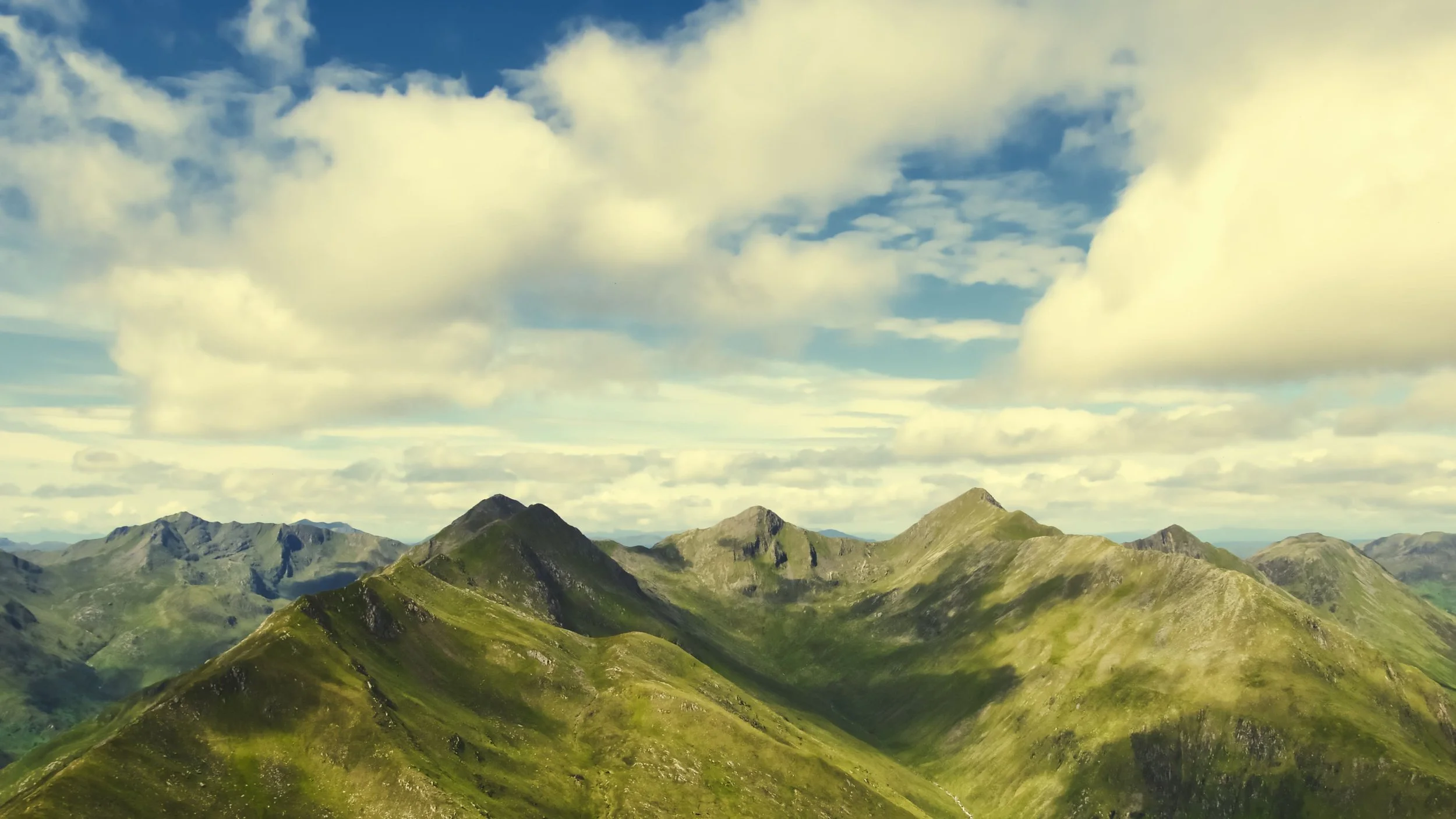
Then I started down the photography route. Like most people new to photo editing, the temptation to make heavy-handed changes for an instant ‘wow’ was to0 great; cranking up the clarity and texture to add details, messing with the point curve and colours to make the image pop. I had a great time and thought I was producing awesome images (I was not!). What I was actually doing was slightly altering the colours in a way that made the images look fake. Skys ended up looking more purple or turquoise, distant hills took on a green/blue hue and and the foreground was way too vibrant.


I didn’t even consider my colourblindness when editing, but as the example above shows, I really should have . Eventually, I did learn to tone it down. My tastes changed and I realised I wanted more subtlety in my editing, I found this to be better than just cranking up the effects to the maximum level. Even with that realisation, I still had the issue of colour and I haven’t found a foolproof way of ensuring I don’t mess this up. It’s more of a trial by error process with safe guards in place for when I’m unsure if I’ve pushed too far. I might ask my girlfriend and our pals to proof. This isn’t ideal as usually they pick up on other things in the edit that aren’t to their tastes and you end up making an image for them and not you. I sometimes use presets from photographer’s whose colour palette I like, then just tweak the other elements knowing the colour is where I wanted it. Other times, I just leave the colours alone! This can limit my edits but I won’t overcook elements like in the above image.
Let’s face it though: editing your pictures is a very personal thing and it‘s done to create your vision of your images. So maybe just embrace the colours you see. As creating a slightly alien world would be something you would love and to do, and might totally fit your style. So long as you love the picture, that’s all that matters! I still do go wild with edits on images I think are a bit ‘Lord Of The Rings’ looking and create 2 versions (realistic & mystic) and these are some of my favourites. I will pop a little gallery underneath so that you can see for yourselves
Thanks for reading & happy editing!


